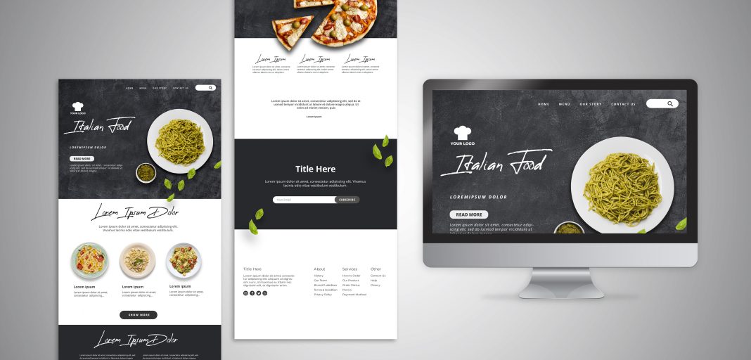
Landing pages play a great role in marketing as it attracts the visitor to become a potential customer by asking for contact information in return. It is also known as “Lead Capture Page” as it is marketed via various channels to get as many leads as possible. In the present time, it has become the most common method to sell products or services and increase your customer pool.
The core purpose of the website is to provide general details about your brand to the public. As for the landing page, it focuses on a single goal that depends upon the brand’s purpose. It consists of a clear and concise CTA so that visitors can be convinced to carry out the required task.
But it doesn’t always end up generating a load of leads even if your marketing strategy is up to the mark. That could be because your landing page is not designed well and is unable to convince the visitors to convert. In that case, you need to make improvements that can help you to get more leads.
We have reviewed several landing pages of renowned brands like Monster Logo Design and many others. We have come up with some of the most effective tips to generate more leads:
Understand Your Audience
Always remember that you have to increase the relevancy of your landing pages to increase your conversion rates. One of the effective methods is to know who your audience is and what they need. If your product or service matches their requirement, then there’s a huge chance that you are going to get a great number of leads. You can also create different landing pages for various target groups which will improve the overall result.
Consider that you are running a clothing store. Now you will design landing pages to target customers living in various regions of the country. You can design a page to promote swimwear and target it in warmer areas whereas a landing page to sell winter clothes should be shown to those people who are living in colder climates. So, always design your landing page based on the interest of your target audience.
Keep Your Form Catchy and Short
One of the most common reasons due to which visitors abandon filling the form is that it is way too long and not attractive. Never use useless design elements in the lead form and it is advised to keep it as simple as possible to allure the visitors. Further, you should only ask for the information that is relevant to you such as email, phone number, address, name, etc. The psychology behind small forms is that visitors are more likely to fill it if it takes less than 50 – 60 seconds.
Not Integrating Social Media Pages
The best feature of Monster Logo Design landing pages is that they have integrated their social media pages which increases the authenticity. That’s what the majority of people forget while designing the landing page. You have to include your social media pages and sharing button as it will assist visitors to share it with their friends and family member.
Captivating Typography
Typography is also important for landing pages. If it is done perfectly, then it will give a sophisticated look and make it much easier for the visitors to read and engage. So, always choose a font that is easy to read and gives a seamless experience as inappropriate typography can make it difficult to read the text and ends up affecting your conversion rates.
Keep It Distraction Free
While designing your landing page, there is one more thing that you should keep in your mind and that’s all about making it free from any distraction that will call off your visitor. Just like Monster Logo Design landing pages, it must have a simple call-to-action button only. Other external and internal links must be removed to make it distraction-free. As a result, it will only convince visitors to fill the available form.
Keeping It Simple
The last and the most important tip is to opt for a minimalist theme. The simpler it is, the more it will appeal to the visitors and urge them to take action on your landing page. Plus, you should keep it focused on a single goal because if there are multiple options, there’s a huge chance that visitors won’t take any action.

